There is a wealth of information in the monthly jobs report. One of the most useful pieces is the year-over-year percent change in Nonfarm Payroll employment. This statistic can tell us a lot about where we are in the business cycle.
Here at RDLB we are all about business cycle turning points. Namely, we are always trying see whether there is a business cycle peak — which would signal the start of a recession– or a business cycle trough — which would signal the end of a recession — in our forecast horizon. Our forecast horizon, by the way, is a year. (More on that in another post)
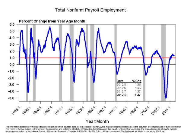
One of the best places we have found to start the search for cycle turning points in on this chart:
The statistic calculated here is the percent change in the level of total nonfarm payroll employment. As you see, the chart has many attractive qualities. The first is that it makes well defined “V” shaped turns around the ends of recessions. The end of a recession is the aforementioned business cycle trough. And, for those who might be having trouble reading the footnote, the shaded areas on the chart are the recession periods designated by the National Bureau of Economic Research (NBER). The other very attractive quality is that we find the recessions in the intervals where the line has gone trough +1% from above and then through zero.
You should also note that the time scale on this chart goes back to 1955, and that every recession that has occurred in that period is plotted on the chart. So, this chart, like a lot of the others you will see in this blog and in my regular reports, are set up to let you see what is going now and to instantly compare what is going now with what has happened in every other recession.
There are some folks out there right now claiming that the economy is already in a recession. I refer them to this chart when I say I disagree. To date, this chart has not missed a cycle peak or a cycle trough call. You can quibble as to whether it gets the dates exactly right, but you can’t fault it for giving false signals.