[vc_row][vc_column][vc_column_text]
Early Knowledge is Profit
An old adage is “Knowledge is power”. In the case of NoSpinFORECAST, we can modify that to “Early knowledge is profit”.

The scoreboard gives a football coach down and distance. That information, and the best scouting reports in the business, give them the knowledge to make intelligent game decisions about tactics and strategy. NoSpinFORECAST gives you business cycle “down and distance” and the most precise economic scouting report about business conditions nine months from now.
ACCURATELY PREDICTING RECESSIONS BY THE NUMBERS!
NoSpinFORECAST predicts business cycle peaks and troughs and does so with unequaled accuracy. NoSpinFORECAST predicted that the 1990 and 2001 recessions would be short and shallow and they were exactly that. It correctly predicted that the recessions of 1975, 1981 and 2007 would be long and deep. For the past 56 years its predictions have been extremely accurate.
[/vc_column_text][/vc_column][/vc_row][vc_row css=”.vc_custom_1449790809112{margin-top: 30px !important;}”][vc_column][vc_tta_tabs spacing=”35″ alignment=”center” active_section=”1″][vc_tta_section title=”Part 1″ tab_id=”Part-1″][vc_column_text][special_tabs]
[special_tab title=”Overview 1″ icon=”info-sign” endoftab]

“For every thing there is a season, and a time to every purpose under heaven.”
~ “Turn! Turn! Turn!,” The Byrds
Ever since societies formed to organize the production and distribution of the goods and services needed for their survival, those activities have ebbed and flowed over time.
That process, in its most basic form, is illustrated by this chart.
Over time, economic activity expands and contracts.
[/special_tab]
[special_tab title=”Overview 2″ icon=”info-sign” endoftab]

- Describing the transit of the modern economy over the phases of the cycle requires a bit more detail.
- And so, to facilitate that effort, we have broken down the expansion and contraction phases into the segments you see on this chart.
- We will now explain what happens at each point and arrow.
[/special_tab]
[special_tab title=”Expansion” icon=”signal” endoftab]

- The green arrow that comes out of the lower left-hand corner describes an economy in which the following is taking place:
- The level of output is rising
- The level of employment is rising
- Inflation is present, but is benign.
- Monetary policy is geared towards facilitating further growth in output and employment.
- This phase can last for many years.
[/special_tab]
[special_tab title=”Boom” icon=”align-center” endoftab]

- The orange arrow, indicates the transition of the economy from the expansion phase of the cycle to the boom phase of the cycle.
- In the boom phase the following things are happening:
- Capacity constraints begin to limit the growth of output. Employment growth slows.
- Inflation becomes less benign as hot spots begin to appear. Monetary policy starts to become restrictive.
- Other aspects of instability begin to appear, such as talk of bubbles or other excesses.
- This phase usually lasts less than a year.
[/special_tab]
[special_tab title=”Peak” icon=”ok-sign” endoftab]

- The transition from the orange arrow to the red arrow takes place at the peak of the cycle.
- The conventions of business cycle dating make it appear that the peak is one point in time. Actually, the peak manifests itself over the course of several months, one of which eventually gets designated as the official start date of the recession.
- Around the peak the following is taking place:
- The level of output begins to decline.
- The level of employment begins to fall.
- The rate of inflation often continues to increase. Monetary policy becomes fully restrictive.
- Depending on what was happening during the boom phase and how monetary policy was applied, the peak can last more than a few months.
[/special_tab]
[special_tab title=”Recession” icon=”money” endoftab]

- The move from the peak to the red arrow marks the transition into the recession phase of the cycle.
- It is only since 1945 that we refer to the contraction phase of the cycle as a “recession”. Prior to that point we either used the term “contraction” or “depression”. However, after the trauma of the Great Depression it was felt that another term needed to be used, and “recession” came into official use.
- The determination of whether or not the economy is in a recession is the exclusive province of the National Bureau of Economic Research [NBER], a private agency based in Cambridge, Massachusetts. The following is the official definition of a recession:
- “The NBER does not define a recession in terms of two consecutive quarters of decline in real GDP. Rather, a recession is a significant decline in economic activity spread across the economy, lasting more than a few months, normally visible in real GDP, real income, employment, industrial production, and wholesale-retail sales.”
- As the definition suggests, the following is taking place during a recession:
- The level of output is falling.
- The level of employment is falling.
- The rate of inflation is slowing, and can turn negative. Monetary policy is fully restrictive.
- How long and how deep the recession becomes depends both on the circumstances that preceded it and on how quickly both fiscal and monetary policy steps are taken to deal with the problem.
[/special_tab]
[special_tab title=”Trough” icon=”microphone” endoftab]

- As was the case with the peak, it is only because of the conventions of business cycle dating that it appears on the chart as a discrete event. In point of fact, the process of forming the trough is identical to that of the forming of the peak and can take several months to come into being. During the trough the following is taking place.
- The level of output stops falling and starts to stabilize.
- The level of employment stops falling and starts to stabilize. The rate of inflation begins to stabilize, usually quite unevenly. Monetary policy shifts from restrictive to stimulative.
- Fiscal policy becomes stimulative.
- The formation of the trough only signals the end of the contraction phase of the cycle.
[/special_tab]
[special_tab title=”Recovery” icon=”money” endoftab]

- The transition to the blue arrow on the chart marks the end of trough and the beginning of the recovery phase. On the chart, the recovery runs from the trough to the level previously attained at the peak. The following is taking place in the recovery phase:
- The level of output begins to rise.
- The level of employment begins to rise.
- The rate of inflation continues to stabilize, but pockets of weakness remain.
- Monetary policy remains stimulative.
- Fiscal policy remains stimulative.
- Because the economic impact of the contraction is always uneven, the process of recovery is always uneven.
- Because the geographic impact of the contraction is always uneven, the location of the recovery is always uneven.
- Because not every sector involved in the contraction feels the effects of the contraction at the same time, the timing of the recovery across the sectors is uneven.
- In addition to the factors just mentioned there are two other elements that affect the process of recovery.
- Recessions come in two types: Cyclical and Structural.
- Cyclical recessions are typically brief and shallow, involving relatively minor adjustments to the economy.
- Structural recessions are longer and deeper. They are preceded by problems that take longer to resolve with effects that cause the economy to function differently than it had prior to the recession.
- How quickly the economy moves through the recovery phase depends entirely on which type of recession we are recovering from.
[/special_tab]
[/special_tabs][/vc_column_text][/vc_tta_section][vc_tta_section title=”Part 2″ tab_id=”Part-2″][vc_column_text][special_tabs]
[special_tab title=”Expansion” icon=”info-sign” endoftab]

- The movement from the blue arrow on the chart to the green arrow on the chart marks the transition of the economy from the recovery phase of the cycle back into the expansion phase of the cycle. During this phase, the following things are happening:
- The level of output is rising
- The level of employment is rising
- The rate of inflation stabilizes and becomes less volatile. Monetary policy shifts from stimulative to neutral. Fiscal policy shifts from stimulative to neutral.
- The major difference between this green arrow segment and the one we looked at earlier has to do with expectations. In this part of the expansion we are looking backward in that we are making sure that the various criterion we have to mark the end of the recovery are being met. In the other segment, we are looking forward, to see whether the criterion we have for the onset of a boom are starting to appear.
[/special_tab]
[special_tab title=”The Dates of the Business Cycle” icon=”signal” endoftab]

- As we mentioned previously the starting and ending dates of recessions are set by the NBER. On the following chart you see the actual chronology of the recessions since 1955. The standard graphing practice is to represent the area between the peak and the trough using the shading you see on the chart. This will be used throughout our presentations.
- The other thing you see on the chart is that the width of the shaded areas varies considerably. Similarly the distance between the shaded areas varies considerably. The question then becomes how is it possible to measure and forecast both the location and the length of the events plotted there?
[/special_tab]
[special_tab title=”The Recessions” icon=”align-center” endoftab]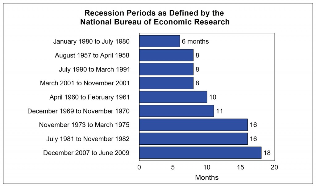
- This chart lists the nine recessions since 1955 in order of length.
- The top six are the cyclical recessions. The bottom three are the structural recessions. And as you see, the recession we just went through is the longest of them all and it was also a structural recession.
- Each of those episodes has its own story.
- And, each of those stories tells us something important about how the business cycle works.
[/special_tab]
[special_tab title=”The Expansions” icon=”ok-sign” endoftab]

- This chart lists the nine expansions since 1955 in order of length.
- As was the case with the recessions, each of these has its own story.
- Like the long recessions, the long expansions include elements of structural change.
- The 1982-1990 expansion was the first in which major sectors of the economy were deregulated and we began to adjust to high energy costs.
- The 1961-1969 expansion was the period in which we built the interstate highway system, moved to suburbia and went to the moon. The 1991-2001 expansion was the period in which we began the computer revolution and built the internet.
[/special_tab]
[special_tab title=”Timing and Forecasting the Business Cycle” icon=”microphone” endoftab]

- Now that we know something about the business cycle works, it is time to take our first look at some tools that we can use to time and forecast the phases of the cycle.
- The next chart lets you see one of our timing tools. This is designed to tell us where we are because, in the famous words of Yogi Berra:
- “You’ve got to be careful if you don’t know where you’re going ‘cause you might not get there.”
[/special_tab]
[special_tab title=”Timing and Forecasting the Business Cycle” icon=”microphone” endoftab]

- Now that we have a way to locate our position on the phases chart, we can turn to a way to forecast when we might see a change in the phase, more importantly, when we might see a business cycle event. That is. when we might see a peak or a trough?
- The next chart is our forecasting tool. The Enhanced Aggregate Spread [EAS]
- On that chart you will see every forecast that the model has made, so that you can see how well the model has done in front of each of the nine cycle peaks and troughs since 1955.
[/special_tab]
[special_tab title=”Timing and Forecasting the Business Cycle” icon=”microphone” endoftab]

- The next chart shows you what the EAS did in the last three cycle events. And, with the expanded time scale allows a little more room for an explanation.
- The first thing you need to keep in mind is that each of the points on the chart was known nine months before the date on which the point is plotted. That’s what the notation of EAS+9 means. In other words, the value you see plotted at the right side of the page (which happens to be June of 2016) was known to us nine months previously, in September of 2015.
- The next thing you need to know is that EAS is not forecasting the level of any particular economic measure, such as GDP. Rather it is making a forecast of the phase of the cycle we can expect to prevail over the forecast horizon. The reason why that stripe of green appears on the right side of the chart is because the forecast is for the expansion phase to be present over that interval
- Finally, the warning of a phase change, from expansion to boom and from boom to recession is based on the EAS going through the red line you see labeled the Danger Zone.
[/special_tab]
[special_tab title=”Our Method” icon=”money” endoftab]

- The forecasting process we use is based on three things.
- The phases of the business cycle
- Our ability to establish our current position in the business cycle Our ability to look out nine months to evidence of changes in the phase of the cycle.
- We call the service NoSpinforecast because we only use numbers you can verify and procedures you can replicate. No black boxes.
- The full details of how we do those calculations are available to you in another chart package you will receive if you “take a spin”. You will also get a sample of the reports in which we maintain the model and comment about current and prospective conditions in the economy.
[/special_tab]
[/special_tabs][/vc_column_text][/vc_tta_section][/vc_tta_tabs][/vc_column][/vc_row]